ARISO
product photography
social media
Ariso is a homegrown brand for premium gifting and decor, rooted in the idea of beginning new traditions while honouring the old. By carrying forward traditional mirror-work in a contemporary form, Ariso creates timeless pieces that add meaning to special moments and lasting value to modern living.
Team Members
N/A
Role
Visual Identity
Photography
Social Media
Duration
2 weeks


THE LOGO
The logo is inspired by the artist’s first mirror-work piece, echoing its intricate pattern. Formed as a circle, it symbolizes continuity - circles never end, they always begin again. This reflects the brand’s philosophy of embracing new beginnings and setting new traditions.
The friendly, serif typography complements the design, making it feel approachable while maintaining a sense of reliability.

THE COLOUR PALETTE

The colour palette reflects Ariso’s duality - the maroon evokes heritage and craftsmanship, anchoring the brand in tradition, while the pistachio green introduces freshness and individuality, setting it apart in the craft-based design space.
The muted beige and blush tones create a soft, grounding base that highlights the mirrorwork’s reflective details, adding warmth, balance, and understated elegance to the overall aesthetic.
THE TYPOGRAPHY
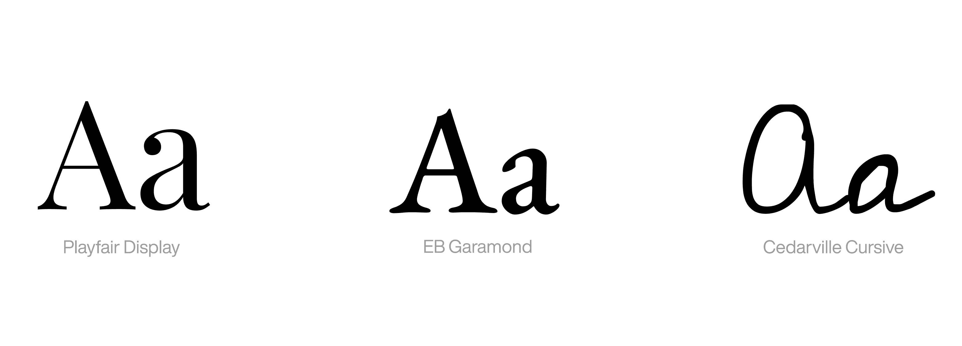
A refined serif with high contrast, evoking sophistication and a premium feel. It captures the elegance of timeless design, making it suitable for impactful headlines and brand statements. A classic serif typeface with historical roots, chosen for body text and supporting content and a handwritten cursive that adds a personal, human touch. Used sparingly, it brings warmth and intimacy to the brand, perfect for notes, quotes, or packaging details.
YOU MAY ALSO LIKE
QUARTER TO PIZZA

PLETHORA